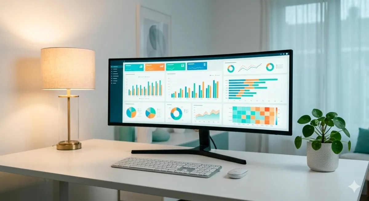
A Business Intelligence dashboard is the tool that transforms mountains of business data into a clear, readable screen in just seconds. It's the heart of any BI system: the point where numbers become decisions.
But not all dashboards are equal. A poorly designed dashboard can be worse than no dashboard at all: it confuses, distracts, and leads to wrong decisions. In this guide, we'll look at how to create effective dashboards, which KPIs to monitor, and which mistakes to avoid.
What is a Business Intelligence dashboard
A BI dashboard is a visual interface (learn more about data visualization) that collects and presents the most important business data in one place. Think of it like your car's dashboard: it doesn't show you every single engine data point, but gives you the essential information to drive safely.
Similarly, a business dashboard shows you:
- Key KPIs: revenue, margins, orders, conversions
- Trends: performance over time, comparisons with previous periods
- Anomalies: out-of-range values requiring attention
- Performance: results by product, channel, geography, salesperson
Unlike a static report, a dashboard is interactive: you can filter by date, click to drill down into data, compare different periods. All in real time.
Business dashboard vs BI dashboard: what's the difference?
You'll often hear business dashboard and Business Intelligence dashboard used as if they were different things. In reality, a business dashboard is simply a BI dashboard applied to your company's data.
The difference is in perspective: someone searching for "business dashboard" typically wants a practical tool to see revenue, orders, margins, and team performance in one place. Someone searching for "BI dashboard" often already has familiarity with the data analytics world.
The goal is the same: turning raw data into useful information for better, faster decisions. In this guide, we use both terms interchangeably.
Types of dashboards
There's no universal dashboard. Depending on the goal, you need different dashboards:
Operational dashboard
Real-time monitoring of daily activities. Example: orders received today, shipment status, open tickets. Update frequency: continuous or every few minutes.
Strategic dashboard
Big-picture view for management. Example: quarterly revenue vs target, gross margin by product line, year-over-year growth trends. Update frequency: daily or weekly.
Analytical dashboard
Deep data exploration for analysts and data teams. Example: customer cohort analysis, conversion funnels, correlations between variables. Update frequency: on demand.
Most SMEs start with a strategic dashboard for leadership and an operational dashboard for sales or operations teams.
Essential KPIs to monitor
The temptation is to put everything in a dashboard. Mistake. An effective dashboard shows only what's needed for decisions. Here are the most common KPIs by business type:
E-commerce
- Daily/monthly revenue and trends
- Number of orders and average order value (AOV)
- Conversion rate by channel
- Top products by sales and margin
- Return rate
B2B sales / field agents
- Revenue by agent and territory
- New customers acquired
- Repurchase frequency
- Product mix sold
- Budget variance
Retail
- Sales by store location
- Average ticket size
- Inventory turnover
- Category performance
- Same-store sales comparison
To learn more about which KPIs to monitor, also read our article on what is Business Intelligence.
How to create an effective dashboard
Creating a good dashboard is a process that requires method. Here are the fundamental steps:
1. Define your audience
Who will use this dashboard? A CEO wants a summary view. A sales manager wants agent-level detail. A marketing manager wants channel data. Different dashboards for different people.
2. Choose the right KPIs (few)
Golden rule: maximum 7-10 KPIs per dashboard. If you need more, create separate dashboards. Each KPI should answer a specific business question.
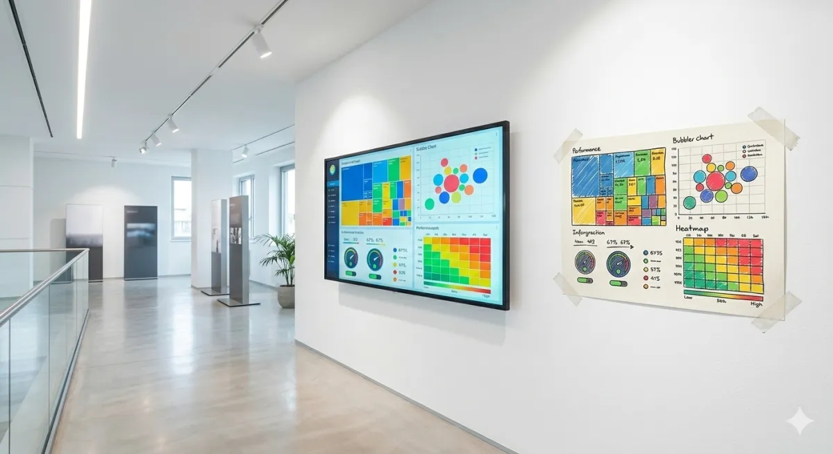
3. Organize visual hierarchy
The most important data goes in the top left (where the eye looks first). Use:
- Large numbers (scorecards) for main KPIs
- Line charts for time trends
- Bar charts for category comparisons
- Tables only for detail data
- Maps for geographic data
4. Use colors meaningfully
Colors aren't decoration. They should communicate information:
- Green: above target or positive trend
- Red: below target or negative trend
- Gray: neutral or context data
Avoid rainbow dashboards with 10 different colors. Fewer colors = more clarity.
5. Add context
A number alone means nothing. "Revenue: €150,000" — is that a lot or a little? Always add:
- Comparison with previous period (last month, last year)
- Target or budget
- Percentage change
Common dashboard mistakes
After seeing hundreds of business dashboards, here are the most frequent mistakes:
- Too much data: if you have to scroll through 3 screens, it's not a dashboard, it's a report
- Wrong charts: a pie chart for 15 categories is unreadable. Use bars
- No filters: a dashboard without the ability to filter by date or segment is static and unhelpful
- Outdated data: if data is a week old, decisions will be late
- No comparisons: absolute numbers without benchmarks are meaningless
Business dashboard: BI tools for SMEs
You don't need programming skills to create dashboards. Modern Business Intelligence tools offer drag-and-drop interfaces that allow anyone to build professional dashboards.
For SMEs, the main selection criteria are:
- Ease of use: the team should be able to use it without lengthy training
- Affordable cost: SaaS solutions with per-user pricing, no high fixed costs
- Local language support: interface and support in your language
- Integration: direct connection with ERP, e-commerce, Excel
Leviathan BI was designed to meet exactly these needs. Customizable dashboards, real-time data, setup in just hours. Try it for free.
Related reading: Discover the essential sales KPIs to display, the best BI tools to build them, and the benefits of cloud BI. For a practical implementation guide, read BI for SMEs: where to start. If you sell online, discover e-commerce specific dashboards.
Conclusion
A well-designed Business Intelligence dashboard is the most powerful tool an SME can have for making fast, informed decisions. It's not about complicated technology — it's about organizing the right data in the right way for the right people.
Start with the KPIs that truly matter, keep it simple, and choose a tool that grows with your business. If you want to see how it works in practice, contact us for a personalized demo.
Related articles

Business Reporting: How to Automate and Save Hours
Learn how to automate business reporting in your SME: from manual Excel reports to interactive business dashboards, with real benefits and practical tools.

Excel Data Analysis: When to Switch to BI
Excel is great for starting out, but it has clear limits. Discover when it's time to switch to Business Intelligence and how to do it smoothly in your SME.
Data visualization: a guide to business charts for SMEs
Data visualization transforms raw numbers into immediate insights. Discover the 7 essential business charts, rules for effective visualizations, and mistakes to avoid.