Data visualization is the art of transforming raw numbers into charts, maps, and dashboards that the human brain can understand in seconds. For SMEs, good data visualization is worth more than a thousand rows of Excel: it reveals patterns, anomalies, and trends that would otherwise stay hidden in the numbers.
In this guide, we cover what data visualization is, which charts work best for each type of data, common mistakes, and how to build effective visualizations for your business.
What is data visualization and why your SME needs it
Data visualization is the graphical representation of information and data. It's not just about "making pretty charts": it's a method for communicating complex insights immediately and clearly.
The human brain processes images 60,000 times faster than text. This means:
- A line chart shows a trend in 2 seconds — a table of numbers takes 2 minutes
- A heatmap highlights sales hotspots instantly
- A bar chart compares product performance at a glance
For SMEs, data visualization is the bridge between the data you already have (ERP, CRM, e-commerce) and the decisions you need to make every day.
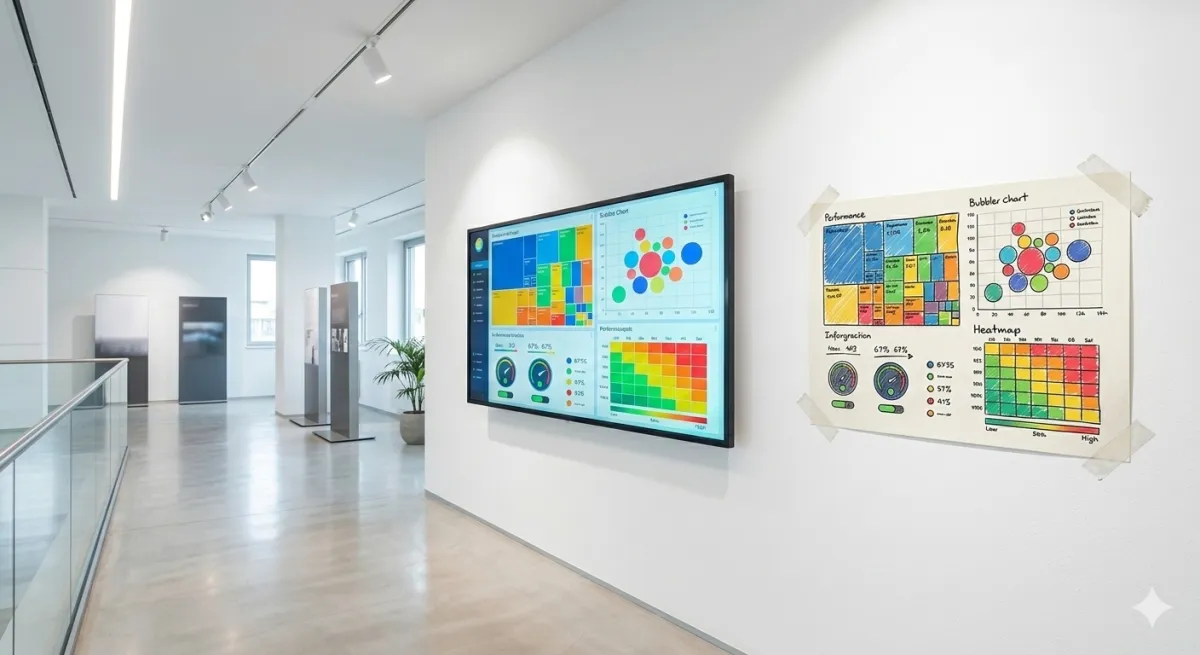
The 7 essential chart types for business
1. Line chart — for trends over time
Ideal for: monthly revenue, web traffic, sales trends. Shows how a value changes over time. Use multiple lines to compare periods (e.g., 2025 vs 2026) or segments (e.g., online vs offline sales).
When NOT to use it: for comparing categories (use bars instead).
2. Bar chart — for comparing categories
Ideal for: revenue by product, performance by agent, costs by department. Horizontal bars work better when you have many categories or long names.
When NOT to use it: for showing time trends (use lines instead).
3. Pie/donut chart — for proportions
Ideal for: market share, revenue distribution by channel, cost composition. But be careful: it only works well with 3-5 slices. Beyond that, it becomes unreadable.
When NOT to use it: with more than 5 categories or when slices are similar in size (the brain doesn't distinguish small differences in circles well).
4. KPI card — for key numbers
A large, clear number with a trend indicator (up/down arrow) and comparison to the previous period. Perfect for business KPIs you need to check daily: revenue, orders, margin.
5. Conditionally formatted table
When details are needed (e.g., customer list with revenue, margin, due dates), a table with conditional colors (green/yellow/red) is more effective than any chart. It's the compromise between numerical precision and visual readability.
6. Heatmap
Ideal for: sales by region, activity by time of day, correlations between variables. Gradient colors make concentrations immediately visible.
7. Funnel chart
Ideal for: sales pipeline, web conversion funnel, lead qualification process. Shows where opportunities are lost at each stage — essential for marketing KPIs.
The 5 golden rules of data visualization
Rule 1: one chart, one message
Each visualization should answer ONE question. "How is revenue doing?" is one question. "How is revenue doing by product, by region, and by channel?" is three questions — and needs three charts.
Rule 2: choose the right chart for the data
90% of data visualization mistakes come from choosing the wrong chart type. Trends → lines. Comparisons → bars. Proportions → pie. Distribution → histogram. Never use 3D charts: they're always less readable than the 2D version.
Rule 3: less is more
Remove everything that doesn't add information: heavy gridlines, redundant legends, decorative colors, 3D effects. Every pixel must earn its place. Edward Tufte calls this the "data-ink ratio": maximize the ink dedicated to data, minimize everything else.
Rule 4: context is everything
Is €150,000 in revenue a lot or a little? It depends on the budget (€120,000 → great), the previous month (€180,000 → decline), last year (€100,000 → growth). Always add a reference: target, previous period, average.
Rule 5: colors with meaning
Use green for positive/above target, red for negative/below target, gray for context. Don't use more than 5-6 colors in a single chart. Avoid red/green as the only differentiator (8% of men are colorblind).
Common data visualization mistakes in SMEs
- Too much data in one chart — 15 lines on the same chart communicate nothing. Filter, segment, simplify
- Truncated axes — a Y-axis starting at 95 instead of 0 visually exaggerates differences. Can be useful in detailed analysis, but misleading in presentations
- Charts without titles or units — every chart needs a title explaining its content and units of measurement (€, %, units)
- Manual updates — if a chart requires hours of manual work to update, it won't get updated. Automation is key
- "Beautiful" but useless charts — word clouds, bubble charts, radar charts: often aesthetic but uninformative for business decisions
From static visualizations to interactive dashboards
An Excel chart is a static visualization: a snapshot of a moment. A Business Intelligence dashboard is an interactive visualization: you can filter, drill down, change periods, compare segments.
With Leviathan BI, data visualization becomes automatic: connect your data sources (ERP, CRM, e-commerce) and charts update in real time. You can create role-specific dashboards:
- Owner/CEO: KPI overview with trends and budget comparison
- Sales: sales pipeline, sales KPIs by agent, forecast
- Marketing: conversion funnel, marketing KPIs by channel, ROAS
- Operations: delivery times, stock levels, productivity
Data visualization: tools compared
For a comprehensive overview of available Business Intelligence tools, check our dedicated guide. In summary:
| Tool | Data Visualization | For SMEs? | Price |
|---|---|---|---|
| Excel | Basic (static charts) | Yes, to start | Included in Office |
| Google Looker Studio | Good (web dashboards) | Yes | Free |
| Power BI | Advanced | Yes (medium complexity) | From €9.40/user/month |
| Tableau | Excellent | Expensive for SMEs | From €70/user/month |
| Leviathan BI | Custom-built | Designed for SMEs | From €20/user/month |
For a detailed comparison between Power BI and Tableau, read our dedicated article.
Conclusion
Data visualization isn't an aesthetic exercise: it's the tool that makes your business data understandable and actionable. A good chart is worth a thousand numbers, but only if you choose the right format, remove the noise, and add context.
Start with the charts you have (Excel) and when it's time to move to interactive, automated dashboards, contact us for a Leviathan BI demo.
Related articles

Business KPIs: Performance Indicators Guide
Business KPIs are the indicators that measure your strategic goal achievement. Discover the 15 essential KPIs for every SME area and how to monitor them effectively.

Cost accounting for SMEs: practical guide 2026
Cost accounting tells you what you really earn per product, customer and project. Learn how to implement it in SMEs without drowning in Excel.

Sales Analysis for SMEs: A Practical 5-Step Guide
How to analyze your SME sales in 5 practical steps: from data collection to segmentation, from trend analysis to concrete actions. Method, tools, and ready-to-use templates.